Project Type
Podcast feature on a mobile app
Podcast feature on a mobile app
My Role
UX design
UI design
Interaction design
Project Timeline
3 weeks
Tools
Adobe XD
Notion
Miro
Photoshop
Project Introduction
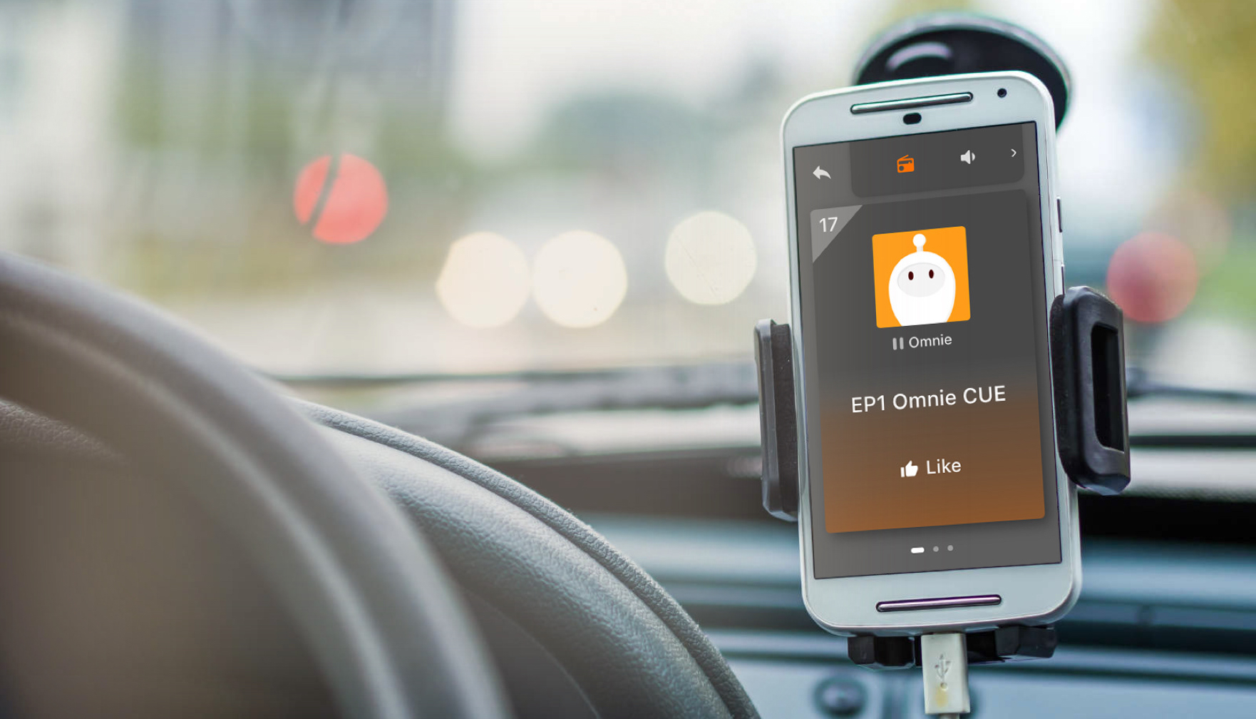
3Sdrive is a tech company that builds assistant apps and provides hand-free interaction and diversified content to create a safer driving experience for the drivers.
I was a UIUX design assistant in the company, partnering with the development team, the project manager, and the project director to create a podcast feature for Omnie CUE, a speedometer and traffic reporting mobile app. This feature is to help the drivers select music and podcasts easily and safely while they are on the road.
Project notes
・The portal to the podcast should be noticeable for the users but not taking away from the main function of Omnie CUE.
・The feature should be easy to operate as it provides a safe driving environment for road users.
・The portal to the podcast should be noticeable for the users but not taking away from the main function of Omnie CUE.
・The feature should be easy to operate as it provides a safe driving environment for road users.
Project Goal
User Goal
・Able to operate the podcast with ease.
・Users could avoid staring at the screen to operate the podcast while driving.
Business Goal
・The feature should help promote the company's podcast channel.
・Encourage the users to drive with and listen to the app while driving.
User Goal
・Able to operate the podcast with ease.
・Users could avoid staring at the screen to operate the podcast while driving.
Business Goal
・The feature should help promote the company's podcast channel.
・Encourage the users to drive with and listen to the app while driving.
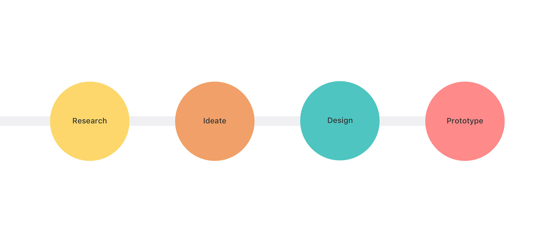
Design thinking
This illustration is a brief of how I discover, approach, and solve the problem.
This illustration is a brief of how I discover, approach, and solve the problem.
Phase 1
Research
・Secondary research
・Comparison analysis
・Secondary research
・Comparison analysis
Secondary Research on Driver's behavior
Operating a mobile phone while driving is dangerous and increases the risk of causing a crash. I aim to bring a smooth user experience to our product and put the drivers' safety as the top priority, but I also need to learn what are the boundary and the limitation in terms of the driving environment that might become part of the design constraints.
・2-second Rule:NHTSA (The National Highway Traffic Safety Administration) recommends drivers should not look away from the road for more than 2 seconds at 70 mph.
・Mobile Phone Driving:Most drivers keep their mobile phone secured in a cradle fixed to the vehicle.
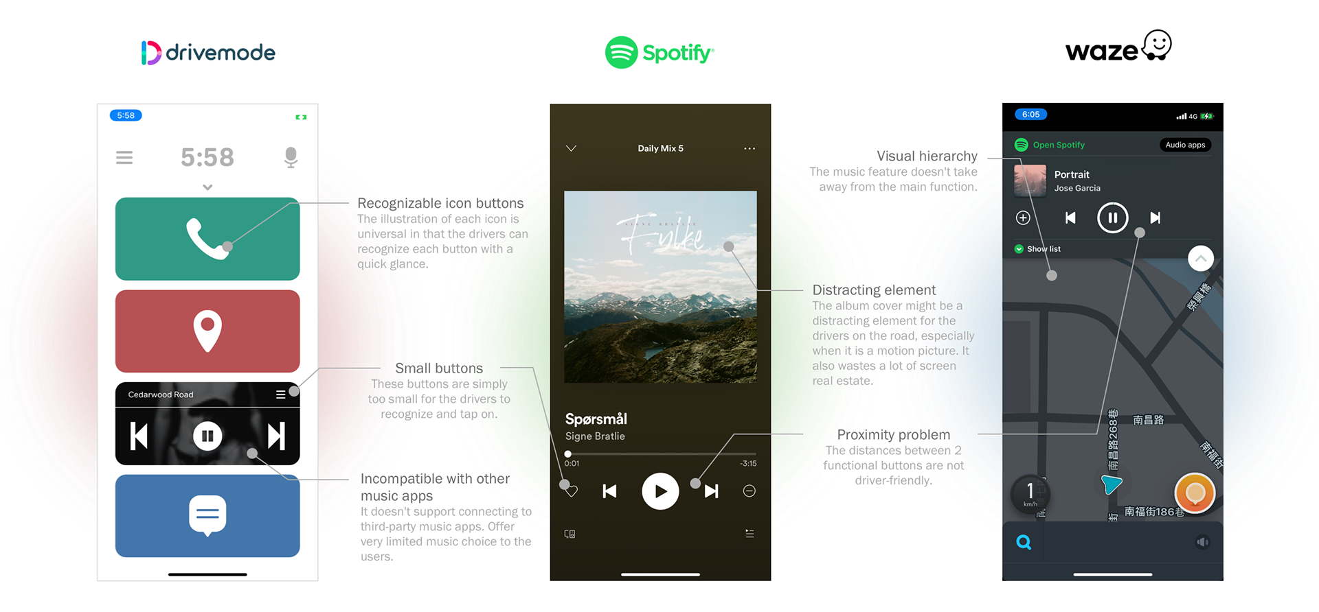
Comparison analysis
Then, I made a comparative analysis of 3 different apps that provide audio streaming service on their user experience and UI interface to understand what are the industrial standard of driving app and their respective pros and cons.
・Keep only necessary functions on the screen that fulfill the users' needs.
・Bold, large, and straightforward UI elements help drivers to make fast decisions.
・Keep each task easy to follow and easy to complete.
Phase 2
Ideate & Design
・Map out the user flow
・Determine design strategies
・Sketches
・Map out the user flow
・Determine design strategies
・Sketches
Problem Statement
To pinpoint the problems, I worked with the project manager to map out an end-to-end experience a user might have with the new podcast feature. Below are the questions that helped to inform the design strategies:
To pinpoint the problems, I worked with the project manager to map out an end-to-end experience a user might have with the new podcast feature. Below are the questions that helped to inform the design strategies:
・How might we promote the podcast feature without intervening the main function?
・How might we help users play/pause, adjust volume, and switch content without distracting them from driving?
・How might we let users switch between the speedometer and the podcast with ease?
・How might we help users play/pause, adjust volume, and switch content without distracting them from driving?
・How might we let users switch between the speedometer and the podcast with ease?
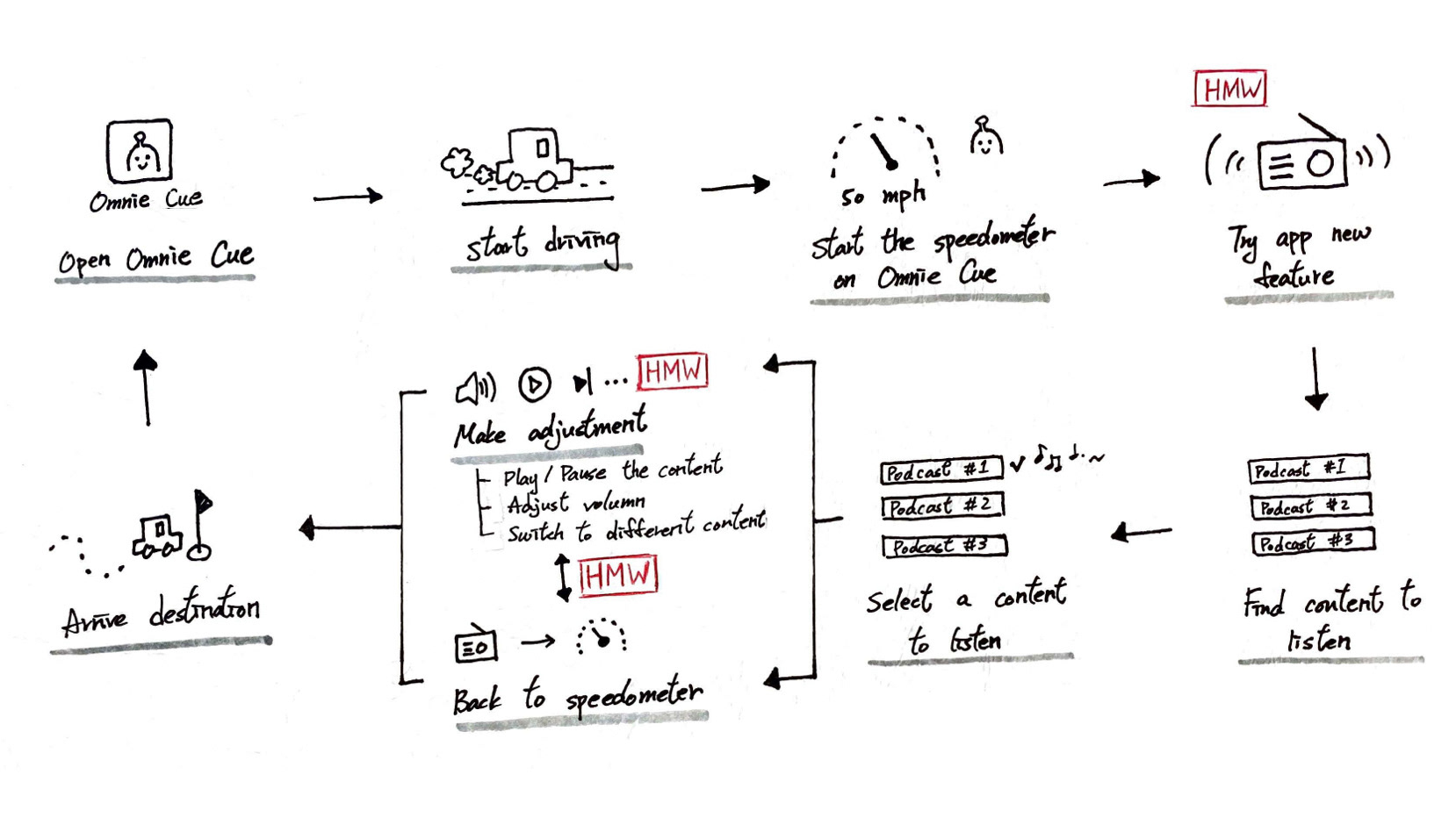
Mapping
This map represents how a user might interact with the podcast feature from start to finish.
This map represents how a user might interact with the podcast feature from start to finish.
Design Strategy
After looking back to the result outcomes and problem statements, I purposed a design concept to the stakeholders, which was then later become the starting point and the core of my design solution.
After looking back to the result outcomes and problem statements, I purposed a design concept to the stakeholders, which was then later become the starting point and the core of my design solution.
"What if we interact with our phone like it is a gamepad!"
Many gamers use the gamepad to control the game and provide inputs without looking at the device's interface, which somewhat similar to what we expect the drivers to do while they are on the road. After studying how people interact with gamepads and a few rounds of discussion, we came up with the below design strategies for the new podcast feature:
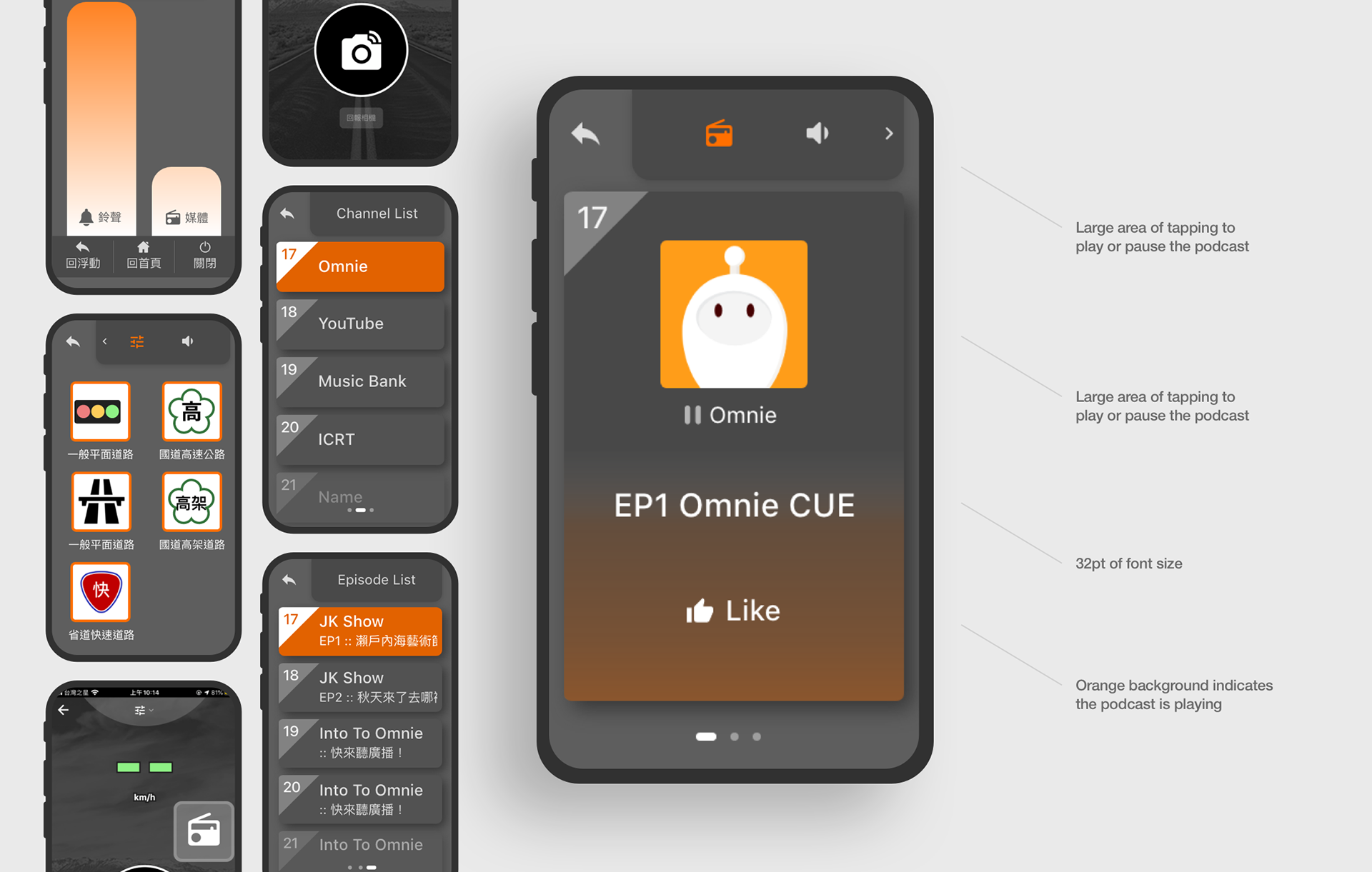
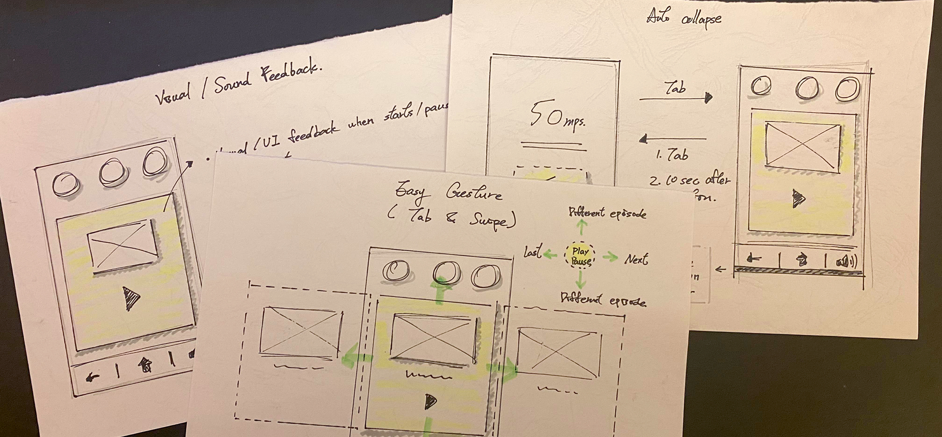
A. Provide sound and visual feedback to help the drivers know what action they have executed
B. Large area tabbing and swiping allows the users to avoid staring at the phone too long
C. Auto collapse system prevents the users from the press the back button to the main page
B. Large area tabbing and swiping allows the users to avoid staring at the phone too long
C. Auto collapse system prevents the users from the press the back button to the main page
Sketches
This map represents how a I visualized the main design concepts on paper.
This map represents how a I visualized the main design concepts on paper.
Phase 3
Prototype & Iteration
・High Fidelity Mockup
・Iteration
・Interactive Design
・High Fidelity Mockup
・Iteration
・Interactive Design
After the 1st version of the design came out, we conducted a quick user testing with colleagues from other departments and observed their reaction to the podcast feature.
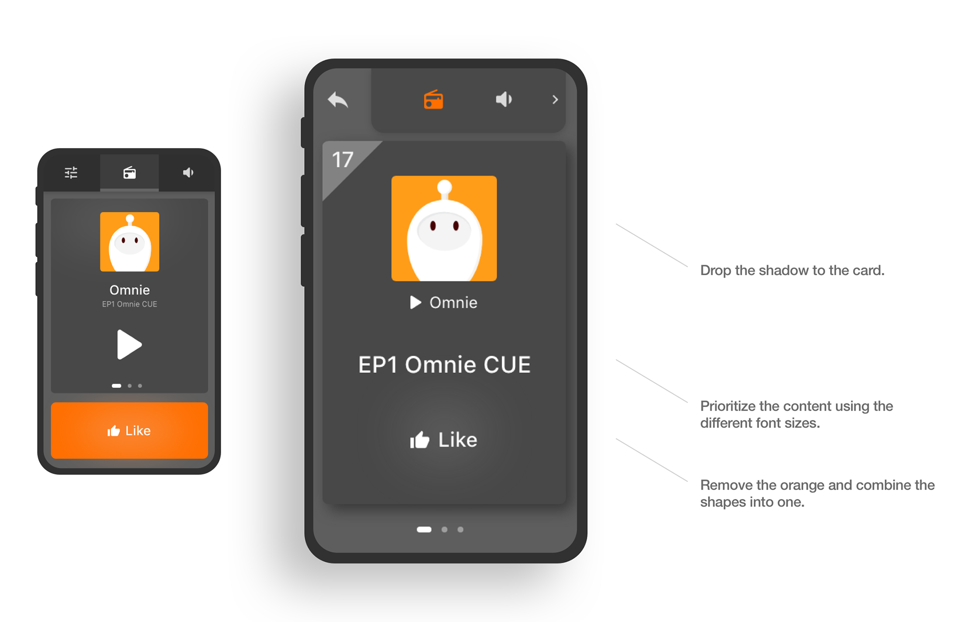
Podcast Card
The original design of the card had more emphasis on the like button (bright orange). And, most of the users did not know how to swipe to the next podcast channel. After discussing with the project manager, we decided to re-arrange the content hierarchy and apply shadow to the card to make it stand out more.
The original design of the card had more emphasis on the like button (bright orange). And, most of the users did not know how to swipe to the next podcast channel. After discussing with the project manager, we decided to re-arrange the content hierarchy and apply shadow to the card to make it stand out more.
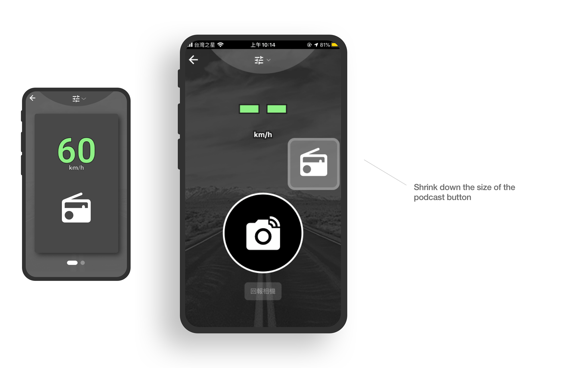
Podcast Portal
After a few rounds of testing, we concluded that the podcast portal in the 1st version of the design took away the importance of the speedometer and traffic reporting function, which are the core of Omnie CUE. In the end, we decided to re-design the portal into a movable, floating button.
After a few rounds of testing, we concluded that the podcast portal in the 1st version of the design took away the importance of the speedometer and traffic reporting function, which are the core of Omnie CUE. In the end, we decided to re-design the portal into a movable, floating button.