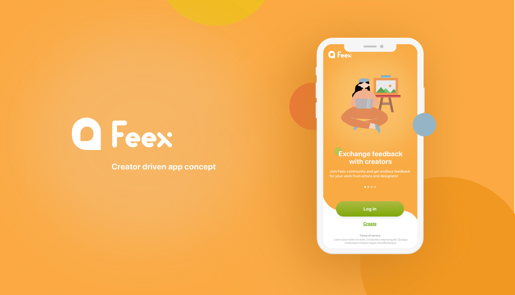
Project Type
Creator driven app concept
Creator driven app concept
My Role
UX design
UI design
Brand design
Project Timeline
4 months
Tools
Sketch
Notion
Miro
Marvel
InVision
Project Overview
For art and design students, the refinement and evolvement of works partially come from critiques. However, it is difficult for students to form a strong community with those outside their academic environment and receive feedback from different groups of people. I believe there is plenty of possibilities to provide a unique user experience to all levels of creators for socializing, connecting, and critiquing.
For art and design students, the refinement and evolvement of works partially come from critiques. However, it is difficult for students to form a strong community with those outside their academic environment and receive feedback from different groups of people. I believe there is plenty of possibilities to provide a unique user experience to all levels of creators for socializing, connecting, and critiquing.
Designer Note
I decided to pursue a direction that I could combine my experience in arts as well as my newly learned UX thinking process for my first UX capstone project. This case study is structured to showcase the design process as transparent as it can be, so feel free to view detailed researches, ideas, and sources by clicking the orange button on the left if available.
I decided to pursue a direction that I could combine my experience in arts as well as my newly learned UX thinking process for my first UX capstone project. This case study is structured to showcase the design process as transparent as it can be, so feel free to view detailed researches, ideas, and sources by clicking the orange button on the left if available.
Problem
Art-and-design education has a lack of evidence demonstrating the variety of its community and environment, which shows the newly emerging problem in the education of art-and-design that needs to be studied and solved.
Goals
User Goals
・Help users to get useful feedback for their work.
・Reduce user's anxiety in socializing.
・Help users to get useful feedback for their work.
・Reduce user's anxiety in socializing.
Business Goals
As my first UX project, I tried to keep the constraints as simple as possible, so the business goal was not considered.
As my first UX project, I tried to keep the constraints as simple as possible, so the business goal was not considered.
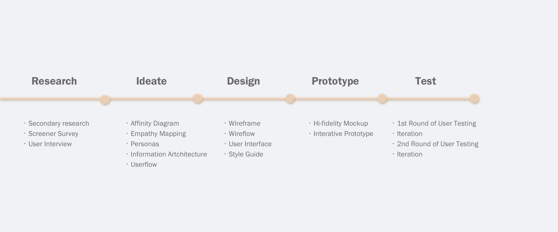

Research
Research is a part of every aspect of design and shows up time and again throughout the design process, setting as a foundation of a project. To quickly gather relevant information to the problem I am trying to solve and also get to know the users more directly about their pain points and goals, I chose to do secondary research, a user survey, and 5 user interviews.
Secondary Research
2M 10%
of arts and design grads per year of arts grads are working artists
User Survey
・66% of the users marked 3 or 2 out of 5 for the questions "How satisfied are you with the art/design course on average?"
・33% of the users get 1 to 2 critiques from their class instructor on one project.
・33% of the users get 1 to 2 critiques from their class instructor on one project.
1:1 User Interview
・Students tend to do what is irrelevant to their majors after graduated.
・Class time is limited, and not every student could get enough critique in the class.
・Students tent to start networking in the very last semester before graduating.
・There is invisible competition between students.
・Class time is limited, and not every student could get enough critique in the class.
・Students tent to start networking in the very last semester before graduating.
・There is invisible competition between students.
Research Outcome
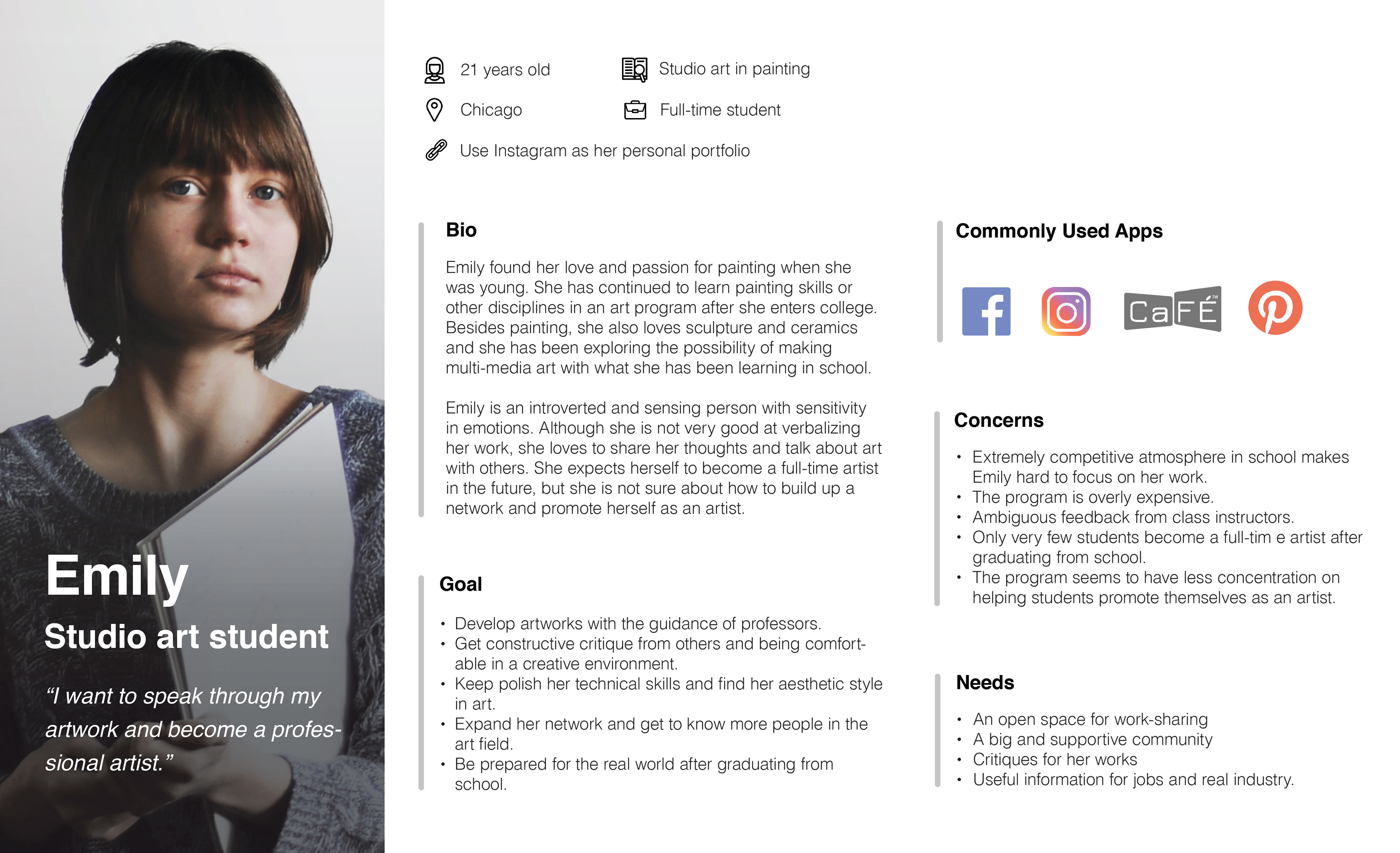
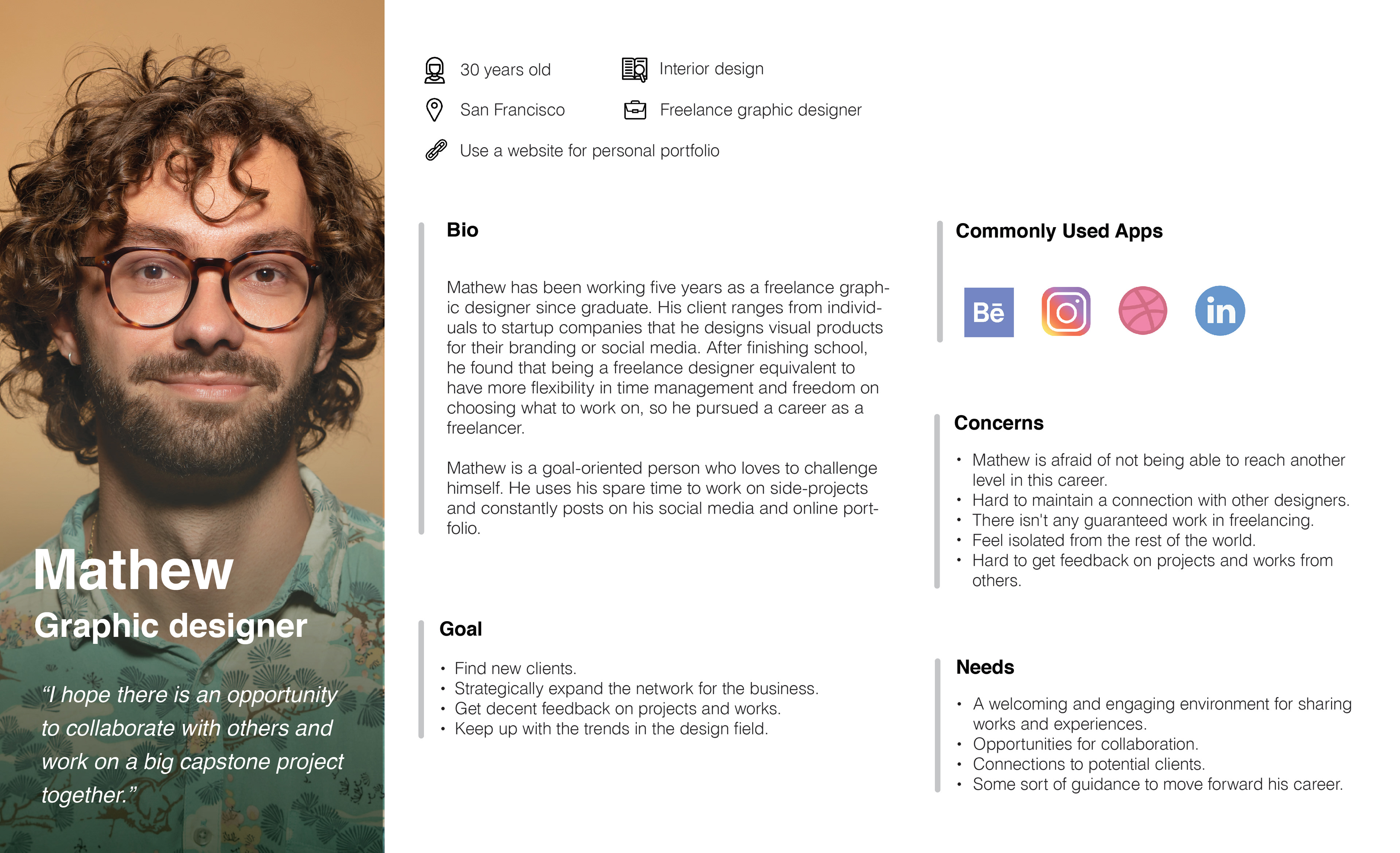
To make sense of the data I collect from user interviews, I synthesis the information through an affinity diagram and empathy mapping. Through the above processes, I prioritize insights, observations, and quotes from the users and 2 personas were created to better understand who the users are and the user needs.

Ideate
After synthesized research, I came up with my problem statements before stepping into the phase of ideation. The previous researches and synthesis outcome would help generate ideas and defined the minimal valuable product (MVP).
Problem Statement
After pinpointing the user's frustrations, needs, and goals from the personas, I came up with problem statements, the key issues that I must answer from my design.
After pinpointing the user's frustrations, needs, and goals from the personas, I came up with problem statements, the key issues that I must answer from my design.
・HMW help the users to get feedback and guidance that are helpful for them?
・HMW create a supportive environment for people to share works and interact?
・HMW create a supportive environment for people to share works and interact?
Minimal Valuable Product (MVP)
To answer the above problem statements, I regularly check back with the user research and user personas to develop sets of user stories based on the features that users may want to see while using the app. From the user stories, I then determined which solution would be defined as the minimal valuable product (MVP), which are listed as follows:
・Feedback Exchange System
・Users can upload the works
・Users can upload the works
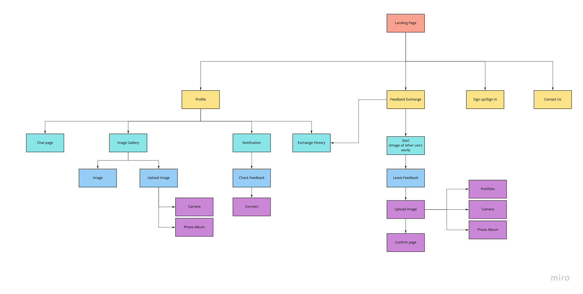
Information Architecture
The main point of creating an information architecture is to organize and structure the pages so that the users can easily find the feedback-exchange portal and navigate through the app intuitively.
To approach, I created a sitemap (below image) to prioritize each page and present the hierarchy of the product function. My two top-level pages are the feedback-exchange and the profile page, where the users can see their posts.
User Flow
To formalize and present the MVP more visually, I created two user flows, one for the feedback-exchange and the other for the profile page, to ensure that both features are intuitive and enticing to the users.

Design
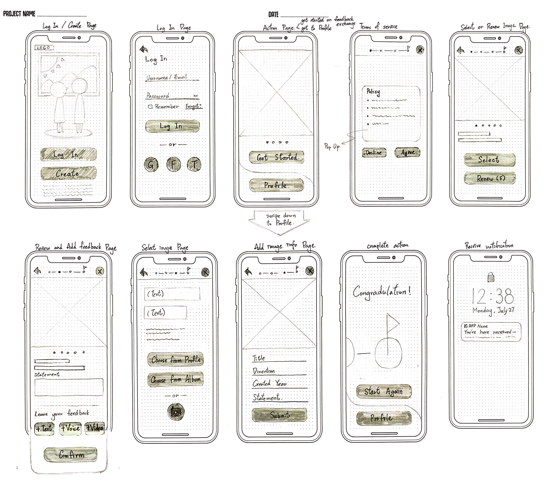
Early iteration
The first step of designing is to create quick, hand-drawn sketches for each page. These hand-drawn sketches can efficiently bring the ideas to life but preventing me from getting too detail into the visuals.

Guerrilla Usability Test
I converted the sketches into a clickable POP prototype using Marvel then I did a quick guerrilla testing on five users to learn what users like about my designs and what aspects of my design are not intuitive.
The main take-aways from the testing are listed below:
・The majority of the participants can't figure out what my app is about without my explanation.
・They express confusion about the exchange process.
・Some of the headlines and texts seems hard to understand.
・The majority of the participants can't figure out what my app is about without my explanation.
・They express confusion about the exchange process.
・Some of the headlines and texts seems hard to understand.
Improvement
What I do for improvement is to refine the use of the words and enhance the consistency of the app, making use that the users could follow the steps without any confusion. I also would make sure there is clear and motivating instruction on demonstrating the exchange feedback process so the first-time user won't get confused.
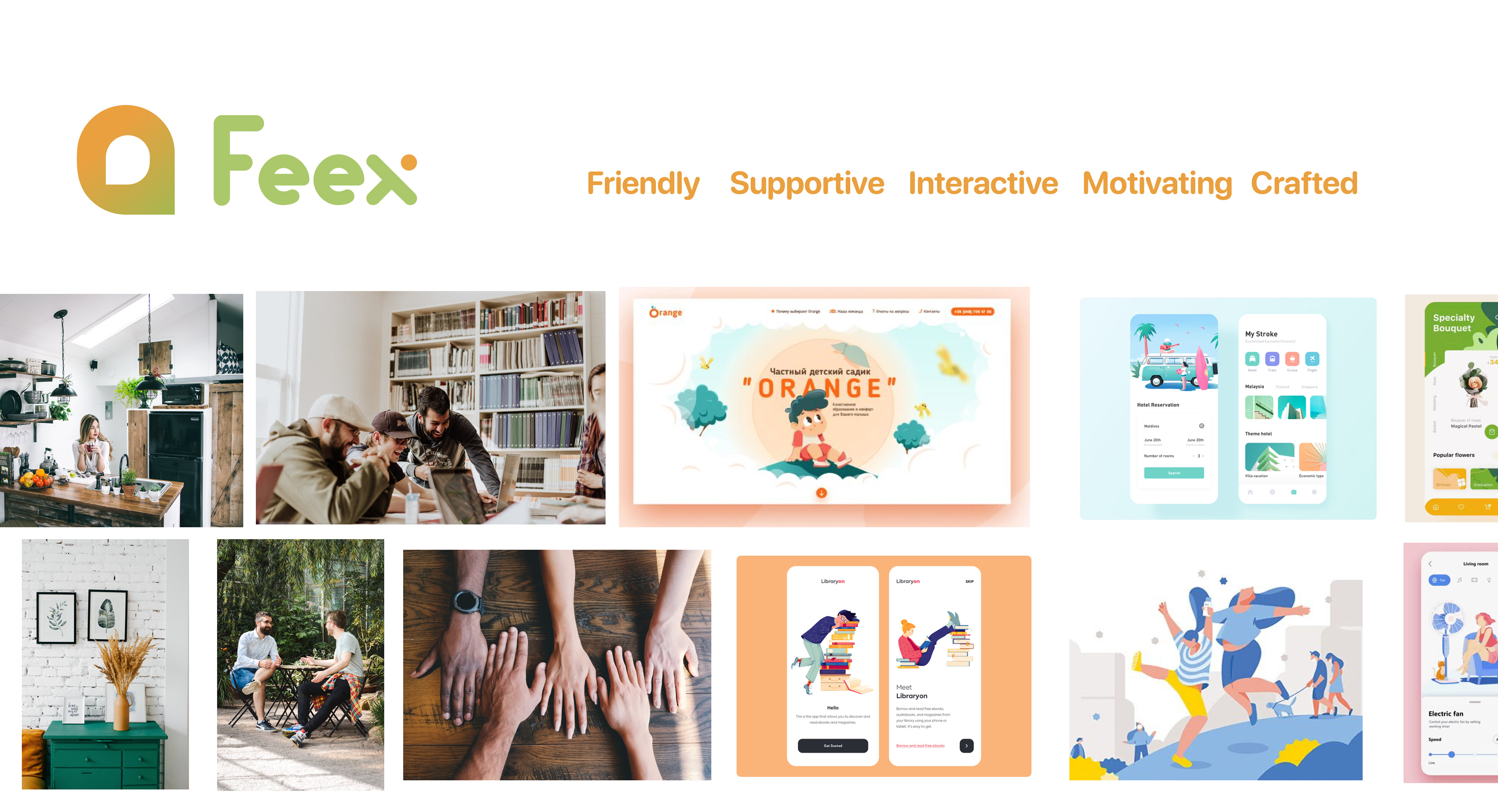
UI Direction
Apart from the UX aspect of my design, I also initialed the UI ideas and styling from Mood board > Brand platform > Product style guidance.
I want the product to be clean and well-crafted, with no reductant function. But, at the same time, there should be refreshing illustrations or small visual elements that motivate users to use the product. I'm thinking of flat characters with bold use of colors, beveled-corner buttons, and a good amount of white space to complement the colors and sorts. To sum up, I like how the visual of below images aligned with the personality and the attributes of my product.

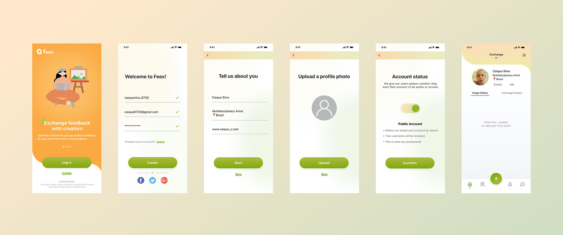
Prototype
Creating high-fidelity mockup based on the sketches and the result of the previous testing make the process of prototyping more efficient. I was able to finish converting each screen of my MVP in a short period of time and move on to the iteration after this phase.

Test and Iteration
During the first round of usability testing with 5 participants, my main focus was to identify obvious usability issues with the prototype and hear the things my test participants wanted to share. Then I iterated each critical issue before my second round of user testing.
Issue #1 Feedback exchange system
80% of the users showed either confused expressions or had no clue what they are supposed to do when they started on the feedback exchange. To solve this problem, I added a one-time instruction (popup) at the start page indicating the process of the feedback exchange system.
During the second round of usability testing, the confession has been dramatically reduced. However, the iteration is an ongoing process. After the second round of the testing, I decided to shorten the feedback exchange system in a way that the users don't have to repeatedly upload their works.


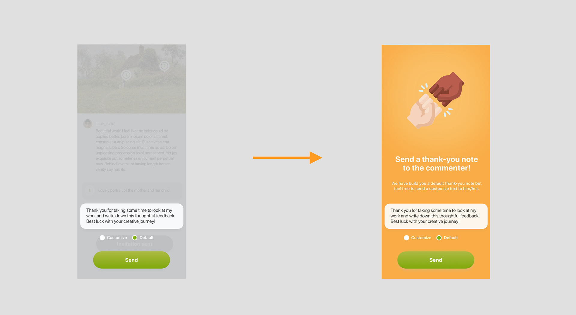
Issue #2 Thank-you note
Feex has a strong consistency in its visual and it seems like the thank-you page has less visual interest than others. 2 of the participants think that it will be easier for the user to understand where they are at by adding the headings or a short description. What I did to improve this situation is to add in the brand color and an inspiring illustration, creating a more consistent visual to the other pages of Feex. In the second round of usability testing, none of the participants brought the issue up but concentrate on the functionality of this page.
Feex has a strong consistency in its visual and it seems like the thank-you page has less visual interest than others. 2 of the participants think that it will be easier for the user to understand where they are at by adding the headings or a short description. What I did to improve this situation is to add in the brand color and an inspiring illustration, creating a more consistent visual to the other pages of Feex. In the second round of usability testing, none of the participants brought the issue up but concentrate on the functionality of this page.

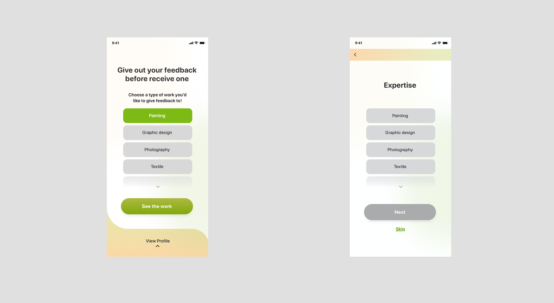
Issue #3 Give Feedback
There should be a system where we pair the user with a commenter that has a similar background and the level of expertise. 3 of the participants would like to choose the type of work they give critiques to. Some of the users have doubts about who will be critiquing their work, especially the commenter’s field of expertise.
To solve the second problem, I add a function in which the users can now pick the category that is most relevant to their expertise. And to echo this function, whenever the user signs up for their account, they will have to provide their expertise such as painting or graphic design, and later the system will pair the work they upload to the other user that also has the same background.
To solve the second problem, I add a function in which the users can now pick the category that is most relevant to their expertise. And to echo this function, whenever the user signs up for their account, they will have to provide their expertise such as painting or graphic design, and later the system will pair the work they upload to the other user that also has the same background.
As a result, this issue has become minor in the second round of user testing.

Take away
As my first UX capstone project, the process, for me, was fun yet really challenging as I’m still adapting myself to think and design like a UX designer. The main takeaway is that the user interview helps pinpoint your problem statement and even there are tons of articles and resources online, the experience share by others directly with you is the most precious and usable information. Secondly, without knowing your problem, the product would not be designed as intuitive and user-friendly as it should be. I also feel like the whole design thinking is a very constructed way to develop a product that we should not skip any step in between if we can.