Project Type
GV Design Sprint
GV Design Sprint
My Role
UX design
UI design
Brand design
Project Timeline
5 Days
Tools
Adobe XD
Notion
Miro
Marvel
InVision
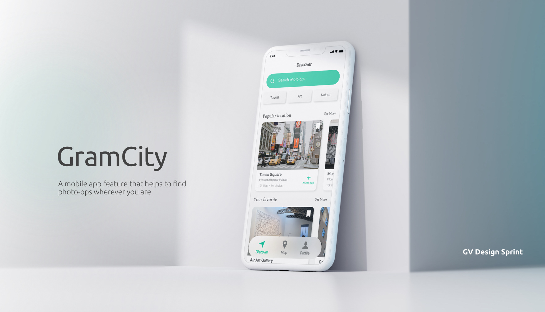
Project Overview
GramCity is initially a photo editing app that helps users easily make their photos look great before posting them on social media networks, and now the startup wants to help people find the most Instagram-able locations to take a photo in any city, such as tourist attraction, iconic architecture, public art, and anywhere someone could take good photos. The new feature should help the users to find awesome places to take photos, wherever they are.
Design Constraints
・This is a feature for the GramCity mobile app.
・The new feature should help the users find physical places and locations.
・Create an active community of users to find and share their favorite locations.
・This is a feature for the GramCity mobile app.
・The new feature should help the users find physical places and locations.
・Create an active community of users to find and share their favorite locations.
Designer Note
I approached this project with the GV design sprint. The brief of this product has already included a few existing research on the problem, but none of the UX results and UI elements are provided on how the current app is designed.
I approached this project with the GV design sprint. The brief of this product has already included a few existing research on the problem, but none of the UX results and UI elements are provided on how the current app is designed.
Project Goals
User Goals
・Locate a photo-op at anytime and anywhere.
・Share favorite locations and photos with others.
User Goals
・Locate a photo-op at anytime and anywhere.
・Share favorite locations and photos with others.
Business Goals
・This new feature should be a stand-alone function, but we wish to see a referral back to our original product - a photo editing app.
・This new feature should be a stand-alone function, but we wish to see a referral back to our original product - a photo editing app.
GV Design Sprint
I completed a 5-days Google Ventures design sprint to quickly create prototypes so that the company could determine if they wanted to go through with the designing or not. The illustration below shows the overall process and the tasks for each sprint.
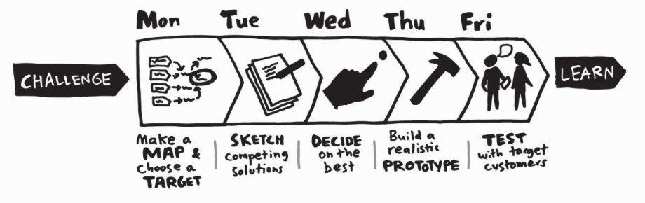
Day 1
Map
・Identify the problems
・Set down the foundation for ideating
・Map out the user flow
・Identify the problems
・Set down the foundation for ideating
・Map out the user flow
Start at the end
To familiarize myself with the problem and draw out the project goals from the “Start at the End” process, I put myself in this scenario:
Imagine you've just arrived in this city you've never been to before, and you are wondering if there are any great photo-ops nearby because you love capturing beautiful images of the place you go and sharing with people on social media. You walk around and try to find a local art mural, but none of your navigation apps shows the location of public art pieces.
Then, I drew out three long-term goals for the product.
・Users can easily find physical photo-op wherever they are.
・A simple navigation system that helps users make precise decisions.
・A social community for the users to share and feel engaged.
User interview & Insights
After setting the goals, I talked to different types of users and asked them how they find photo-ops. Below are the key insights from the interview synthesized by affinity mapping.
・A good photo-op is objective. It can be defined by its visual appearance, distance, or popularity.
・Some people plan out where to go or what to capture beforehand.
・People are looking for physical locations.
・Some people like to go on an adventure tour for photos, some people don’t.
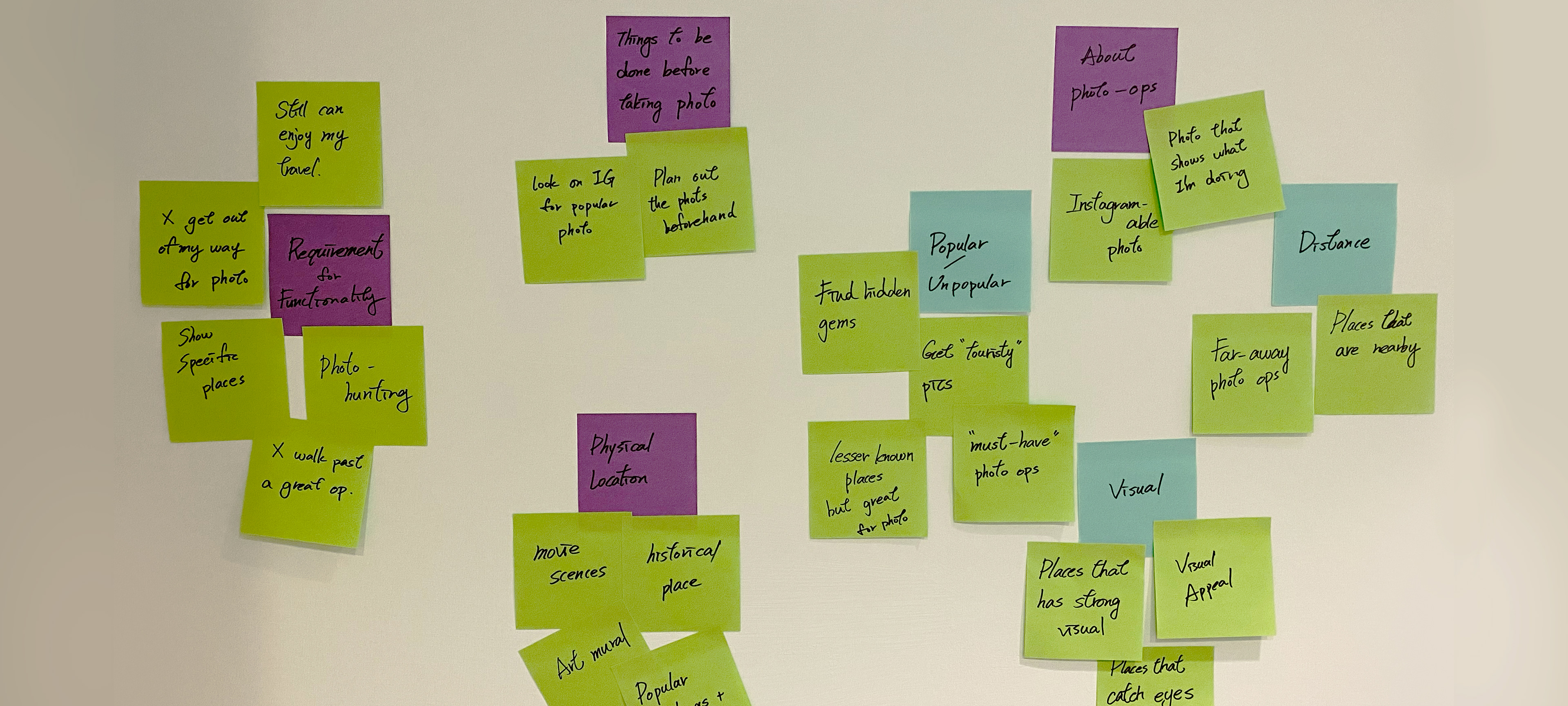
Affinity mapping
Information based on user interview
Information based on user interview
Map and Problem Statement
Then, I mapped out a possible end-to-end experience a user might have with the product to understand the user needs and articulate specific questions that need to be addressed in the design.
Then, I mapped out a possible end-to-end experience a user might have with the product to understand the user needs and articulate specific questions that need to be addressed in the design.
・How might we help users find the type of photo-op they like?
・How might we motivate users to share their photos on the platform?
・How might we reduce the conflicts between taking photos and traveling?
・How might we motivate users to share their photos on the platform?
・How might we reduce the conflicts between taking photos and traveling?
Mapping
How does the user find photo-ops based on their interest.
How does the user find photo-ops based on their interest.
Target User & Personas
The last task for the day was deciding the target users to know who we are designing for, so I created a persona to define the chosen types of users and understand their frustration and their goals.
Nick, a gallivanter, loves taking road trips once a while and documenting with photography. He is afraid of missing out on nearby photo ops. He wishes to save some time and find great photo-ops by using the new launch feature on GramCity.
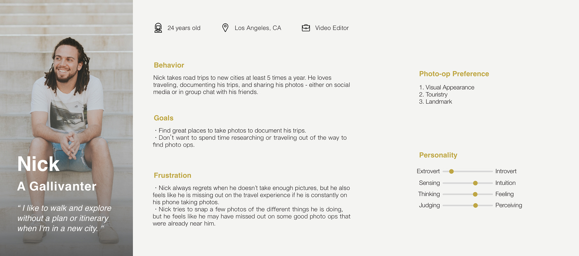
Persona
Nick, a gallivanter who is afraid of missing out on nearby photo ops.
Nick, a gallivanter who is afraid of missing out on nearby photo ops.
Day 2
Sketch
・Sketch ideas
・Ideate and generate possible solutions
・Sketch ideas
・Ideate and generate possible solutions
Lightning Demo
Before picking up my drawing pencil, I conducted a solo version of the lightning demo for secondary research and to do a quick competitive analysis of existing products. I was specifically looking at products that have a great categorization and map function, where users can find things easily on the app and locate places. The patterns I've uncovered were:
Before picking up my drawing pencil, I conducted a solo version of the lightning demo for secondary research and to do a quick competitive analysis of existing products. I was specifically looking at products that have a great categorization and map function, where users can find things easily on the app and locate places. The patterns I've uncovered were:
・The daily feature and recommendation help users make a quicker decision.
・A map without unnecessary information seems easier to use.
・Clean user interface without color overload.
・A map without unnecessary information seems easier to use.
・Clean user interface without color overload.
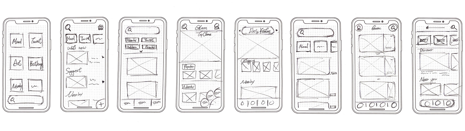
The Crazy 8's
After the lightning demo, I spent 8 minutes hashing out 8 different solutions to categorize photo-ops, after which I was able to decide which I should proceed with. To create an intuitive design and to approach the product goals, I decided to highlight the following function in the product:
・A stand-out search function
・Quick switch between Discover, Map, and Profile page
・Minimalistic layout and recognizable icons
・Logical way to categorize each type of location
・A stand-out search function
・Quick switch between Discover, Map, and Profile page
・Minimalistic layout and recognizable icons
・Logical way to categorize each type of location
Day 3
Decide
・Pick an idea
・Flesh out the storyboard and wireframe
・Pick an idea
・Flesh out the storyboard and wireframe
As a solo designer for this sprint project, instead of pitching my design ideas with my teammates, I reviewed all the design ideas from yesterday, evaluated them, and fleshed out a storyboard for the final solution I chose.
Design Strategy
Revisit the research and problem statements, how to help travel-lovers like Nick, find the photo-ops they are interested in. Below are the design strategies used to align with the product goals and to answer the problem statements.
・Categorization: Different categories and types of location that helps the users find their desired photo-ops more easily.
・Location Guide: Users could add variable photo-ops to the map, and the system will calculate the best route for them according to what travel methods they chose.
・Sharing Images: The newly posted photo will feature on the platform where other people can see when they click on the detail page of this photo-op.
Then, I created a storyboard and a wireframe sketch that show exactly how the user will step through the prototype within a scenario, click by click.
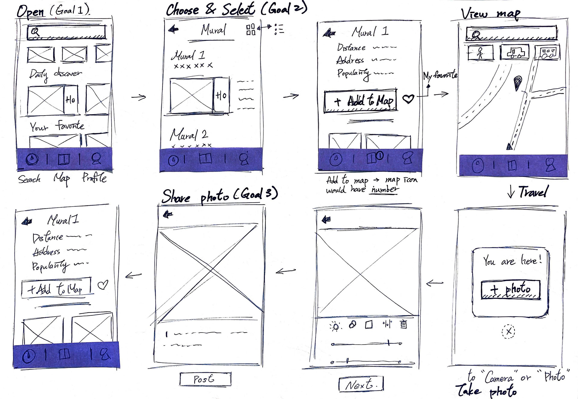
Wireframe sketch
This wireframe sketch quickly map out the user flow of the app product based on the storyboard.
This wireframe sketch quickly map out the user flow of the app product based on the storyboard.
Day 4
Prototype
・Create a prototype
・Create a prototype
Prototyping has always been the part that excited me the most in a UX process, and I aimed to create a realistic facade that I can put in front of the users to gauge their reactions to my idea.
To make sure the users can navigate and follow the flow with ease, I designed the UI aspects with the following:
・The maximum white space reduced content overload.
・Straightforward navigation with both icon and text labels
・The primary green is only used on CTA buttons or pop-ups.
To make sure the users can navigate and follow the flow with ease, I designed the UI aspects with the following:
・The maximum white space reduced content overload.
・Straightforward navigation with both icon and text labels
・The primary green is only used on CTA buttons or pop-ups.
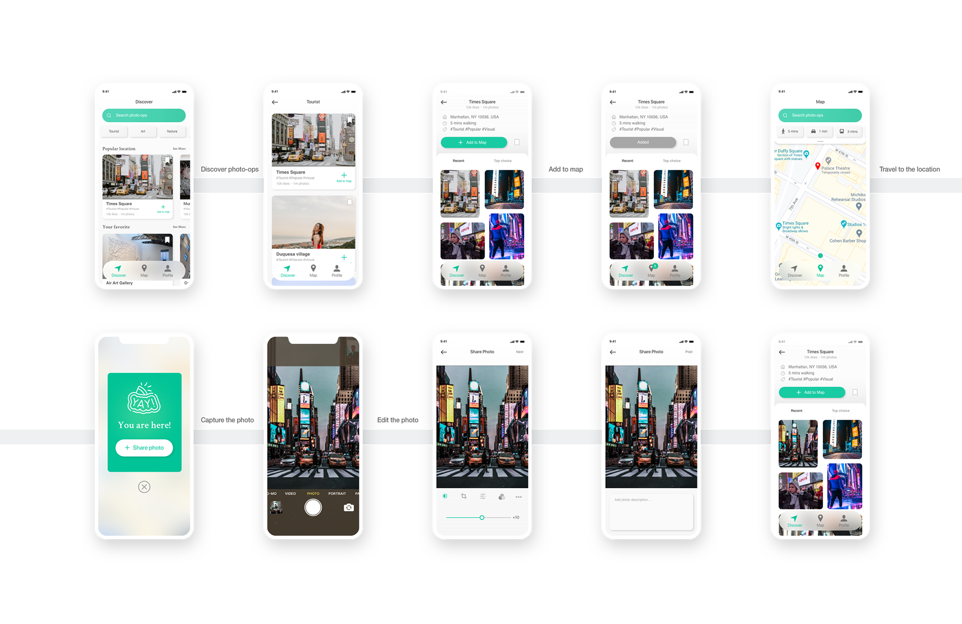
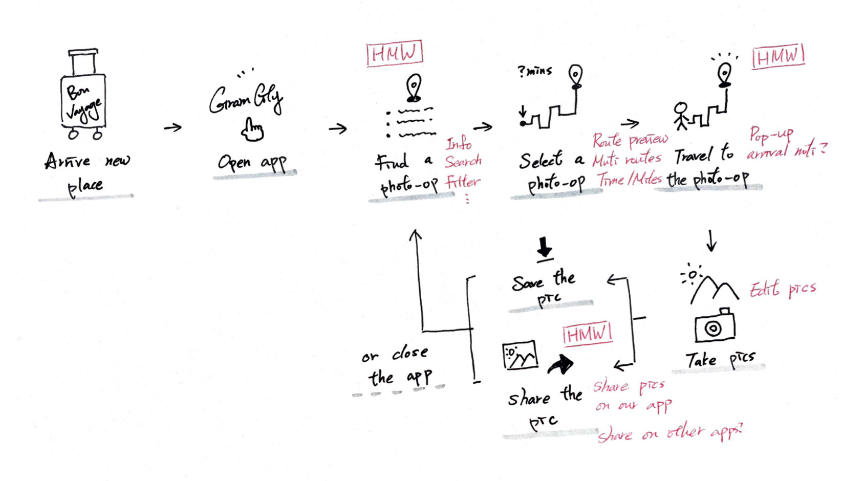
Wireflow
This wire flow presents how a user finds a photo-op, take a photo, and share it using the app.
This wire flow presents how a user finds a photo-op, take a photo, and share it using the app.
Day 5
Test
・Conduct user testing
・Iterate design
・Conduct user testing
・Iterate design
The last sprint is all about testing. I prototyped my ideas and now it's time to put the design to the test. I recruited 5 users for the usability testing and asked them to complete a series of tasks to uncover UX issues in the product. During each session, I was testing specifically on:
・Find the specific photo-op and add to map.
・Capture a photo of the location and make a post.
The results revealed a couple of things, bad and good, and the insights got me thinking how I should iterate my design to make it more intuitive and user-friendly.
・Find the specific photo-op and add to map.
・Capture a photo of the location and make a post.
The results revealed a couple of things, bad and good, and the insights got me thinking how I should iterate my design to make it more intuitive and user-friendly.

Arrival Notification
The pop-up screen was designed to remind the users they have arrived at the location. During the testing, 4 of the 5 users expressed unsureness on this design page as they thought it looks too much like a warning sign, not a reminder. Therefore, I iterated the pop-up into a notification bar on the top.
The pop-up screen was designed to remind the users they have arrived at the location. During the testing, 4 of the 5 users expressed unsureness on this design page as they thought it looks too much like a warning sign, not a reminder. Therefore, I iterated the pop-up into a notification bar on the top.
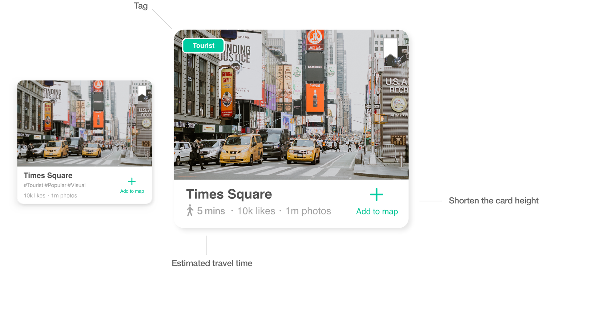
Photo-op Card
The tags were designed too small, and they are not essential info to the users. Therefore, I removed the tags and replaced them with estimated travel time.
The tags were designed too small, and they are not essential info to the users. Therefore, I removed the tags and replaced them with estimated travel time.
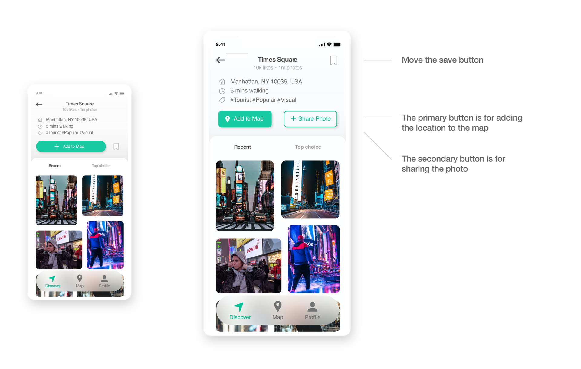
Sharing Image
The initial design lets the users upload the photo only when they are close to the location, but that is not user-friendly. There should be an option for the users to post the image later and also select the existing photo from their photo album.
The initial design lets the users upload the photo only when they are close to the location, but that is not user-friendly. There should be an option for the users to post the image later and also select the existing photo from their photo album.
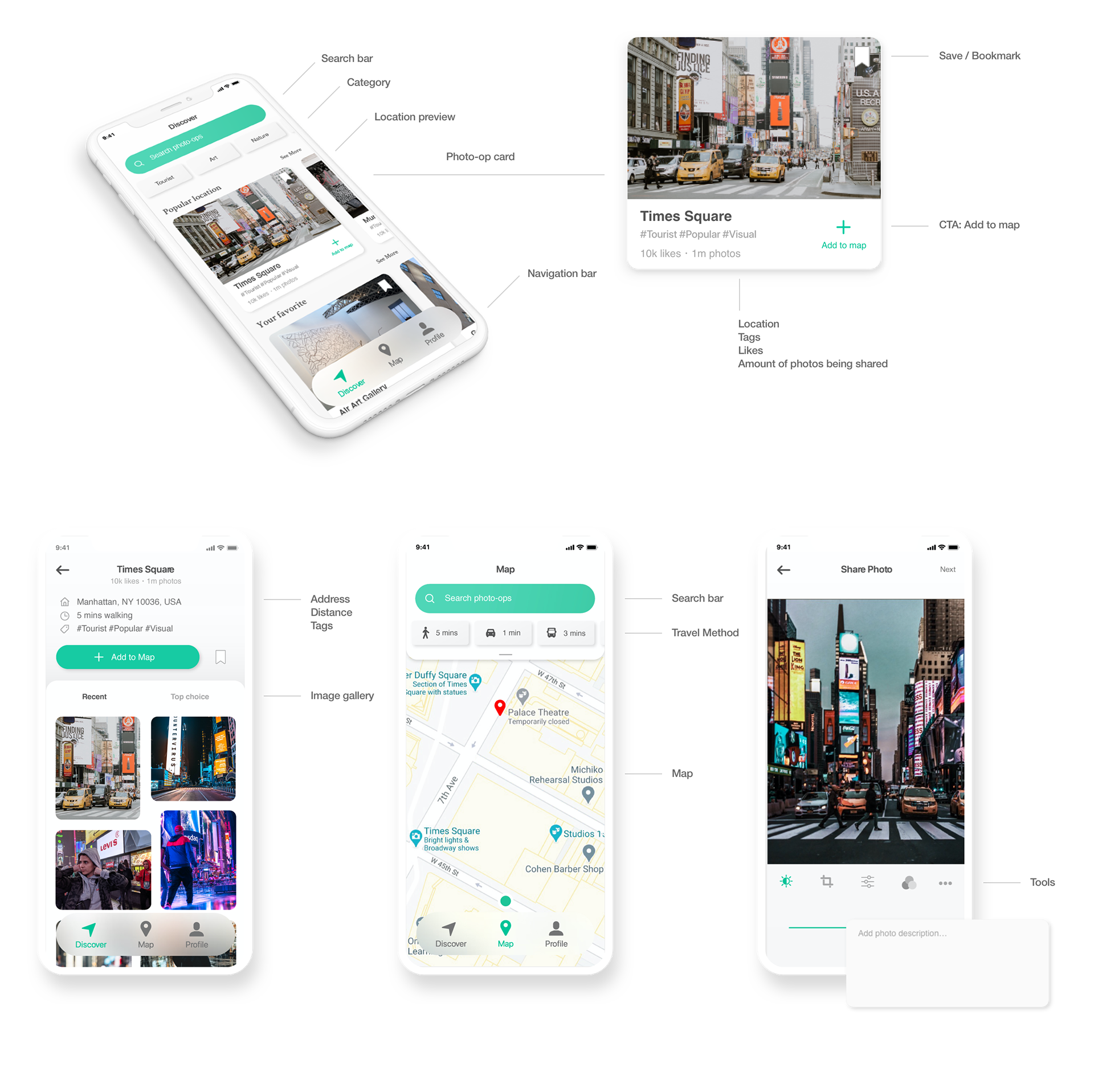
Final Solution
Search photo-ops
Add photo-ops to Map
Reflects
Before I ended the sprint, I reflected on the process. The time limit made the development of the concept and product more intense than the traditional waterfall process, but the outcome is definitely worth it. Focusing on the most important issue and solving the essential problems simultaneously is one of the most efficient ways to design and iterate a product.
Deliver Ideas & Precise Decisions
Divergent and convergent thinking are the two most important ways of thinking, and I learned that they are particularly useful tools with a tight schedule like the GV design sprint. They helped me brainstorm ideas and filter one that seems to be the most suitable solution in the situation.
User Testing
Although with an intense schedule, user testing is the key to discover the issues in the initial design that I would not have discovered. During the testing session, I should have avoided using the words that directly suggesting an action to the users. Lesson learned!