Project Type
E-commerce redesign
E-commerce redesign
My Role
UX design
UI design
Project Timeline
4 weeks
Tools
Sketch
Notion
Miro
InVision
Photoshop
Project Introduction
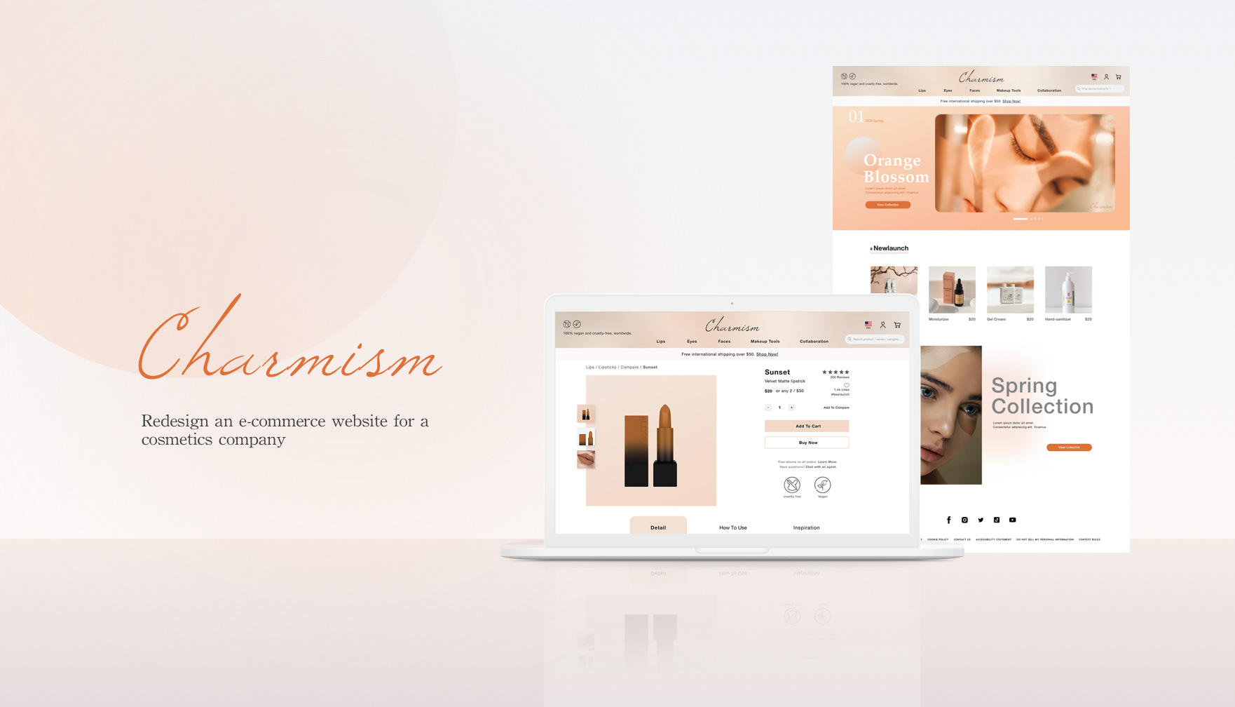
Charmism is a cosmetic company selling cruelty-free and vegan products. They need to enhance their browsing and checkout experience to greatly improve their product’s usability, and the company approached me to identify problems and find solutions within a 4-week timeframe.
Charmism is a cosmetic company selling cruelty-free and vegan products. They need to enhance their browsing and checkout experience to greatly improve their product’s usability, and the company approached me to identify problems and find solutions within a 4-week timeframe.
Important notes from PM
・The data shows 50% of users open on average 7 item pages and then abandon the site without moving any items into the cart.
・Data shows that 70% of users who place an item in the cart do not purchase and the users abandon the cart on the registration page, which they must make an account to purchase.
Designer note
Despite an academic project, I was designing within a context in which I can simulate what it’s like to work in a real industry with time pressure, design design constraints, and business goals.
Despite an academic project, I was designing within a context in which I can simulate what it’s like to work in a real industry with time pressure, design design constraints, and business goals.
Project Goal
User Goal
・Have a flawless experience in purchase items online.
・Able to compare products more efficiently.
Business Goal
・Improve the conversion from browse to completion of checkout to increase revenue on the product’s mobile-web experience.
User Goal
・Have a flawless experience in purchase items online.
・Able to compare products more efficiently.
Business Goal
・Improve the conversion from browse to completion of checkout to increase revenue on the product’s mobile-web experience.
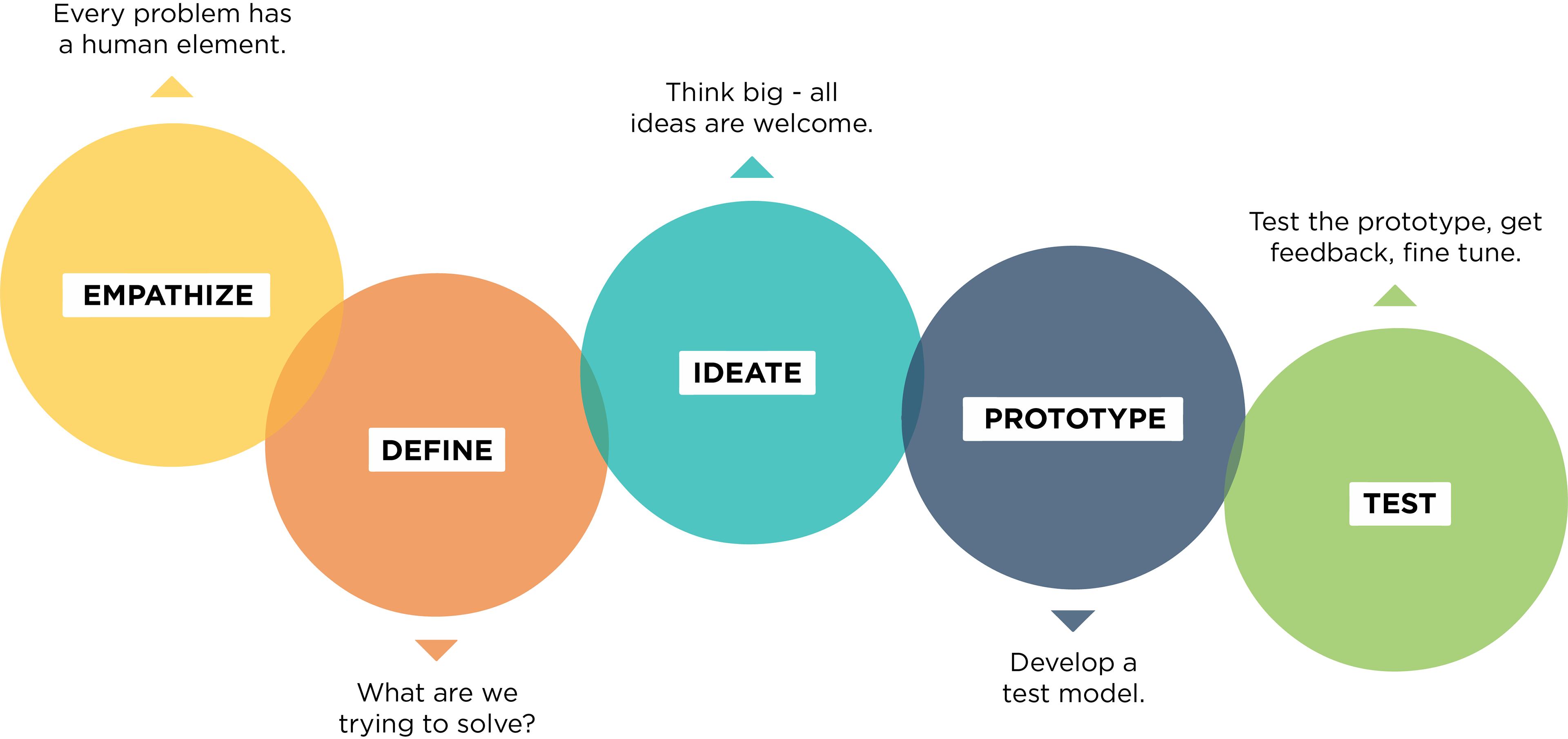
Design thinking
This illustration is a brief of how I discover, approach, and solve the problem.
This illustration is a brief of how I discover, approach, and solve the problem.
Phase 1
Research
・Secondary research
・Survey
・User Interview
・Competitive research
・Secondary research
・Survey
・User Interview
・Competitive research
Researching for re-designing an e-commerce website could be at a big scale, but the notes from the project manager helped me set a clear research direction without being aimless. I was particularly gathering data for the below topics:
・The buying patterns of shopping cosmetics online
・Online product comparison
・Check-out process
I approached different research topics and types of data through a variety of methods, including secondary research, user survey, and user interview. Below is a summary of what I found.
Buying Patterns
4 of the 5 interviewees said they land on a shopping site with a clear intention of what to purchase and use the site category or search function to find products. From the secondary research and the user interview, I learned that the 3 most essential purchase criteria to users are product price, product quality, and online reviews.
Product Comparison
The top criteria when comparing products are product price, product quality, review and rating, and the product format. 2 of the interviewees said they usually open multiple tabs to make a comparison between each product, and they think it is a tedious action to do.
Check-out Process
Based on the user survey of 54 responses, 57.4% of the survey participants often abandon their cart before checking out, and the most common reason is because of the unexpected price add up and realizing they don't need the products.
Phase 2
Synthesis
・Affinity Map
・Empathy Mapping
・Personas
・Affinity Map
・Empathy Mapping
・Personas
Affinity Map & Empathy Mapping
To synthesize the data, I first created an affinity map to distill, categorize, and prioritize the research findings. Then, an empathy map was informed to pinpoint the goals and the pain points of the user, who uses the online shopping platform to purchase cosmetics and beauty products.
・User pain point: Users feel insecure the product might fall out their expectations.
・User goal: Users like to efficient shopping experience and decision online.
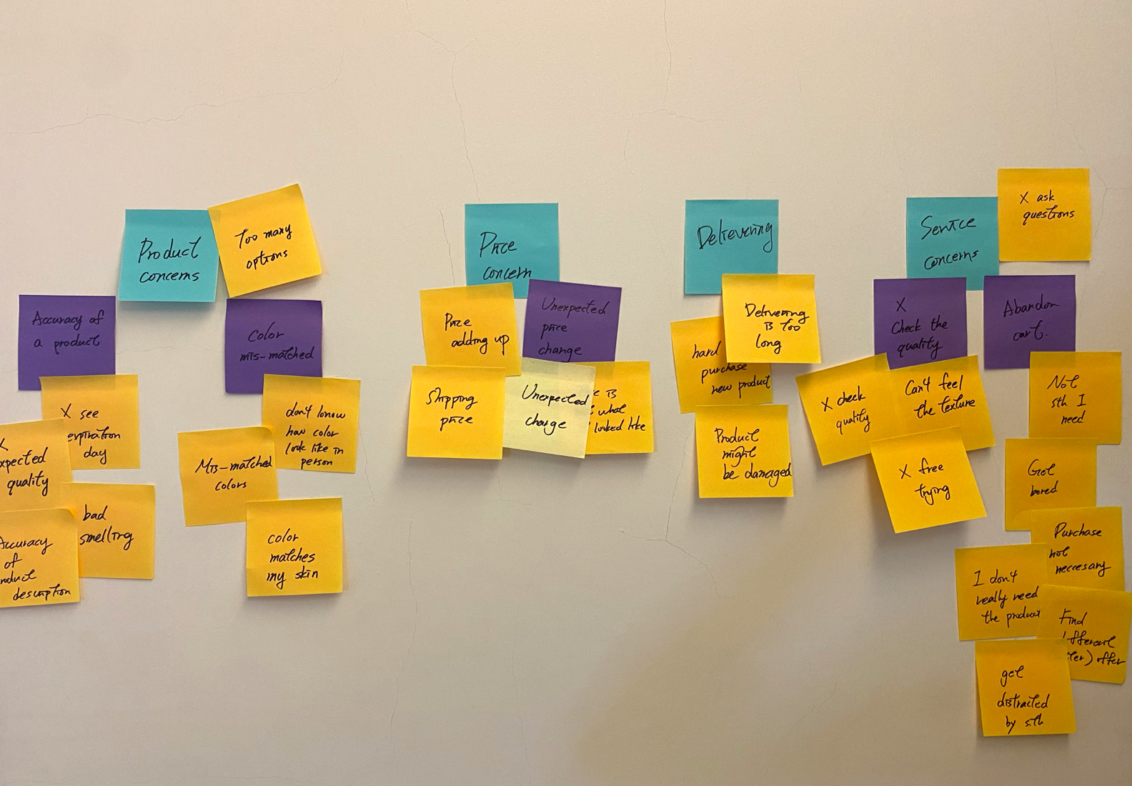
Affinity map
Distill and categorize the data gathered from the research.
Distill and categorize the data gathered from the research.
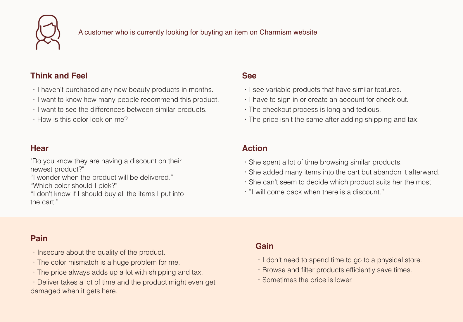
Empathy mapping
Visualize the user's attitudes and behaviors.
Visualize the user's attitudes and behaviors.
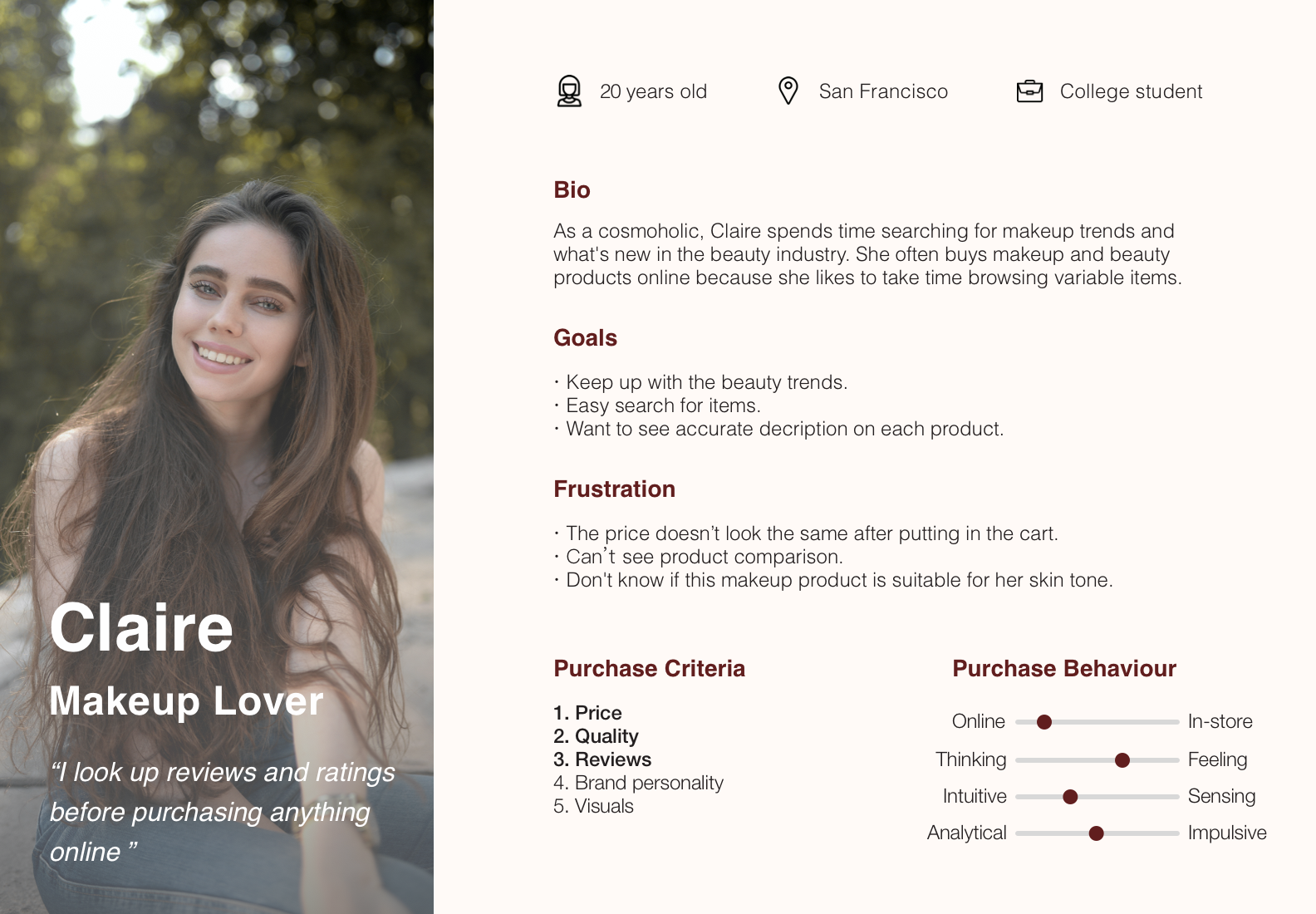
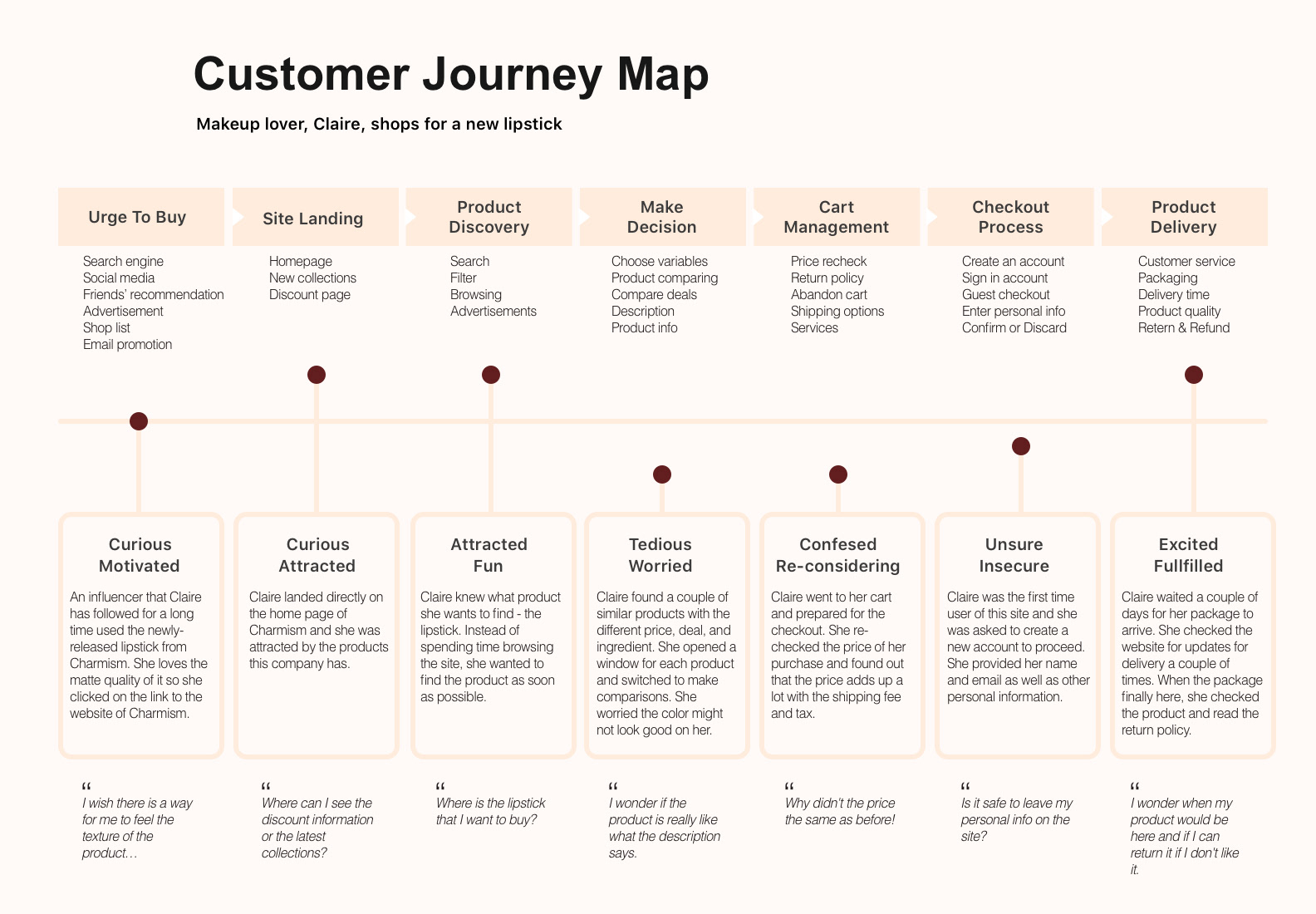
Persona & Journey Map
With the synthesizing result from the affinity mapping and empathy map, I created a persona to target the user type.
Claire is a makeup lover who takes online reviews and friends' recommendations into account when buying cosmetics and beauty products online. She loves trying actual products in-store but purchasing online for extra discounts.
To understand how Claire would do at each stage of the interaction with the web to complete her purchasing experience, I made a journey map from her perspective, listing down the touch-points, obstacles, and questions she may encounter.
Phase 3
Ideate & Design
・User flow
・Wireframe
・Guerrilla user testing
・Style guide
・User flow
・Wireframe
・Guerrilla user testing
・Style guide
Design Strategy
I started to ideate solutions by sketching out as many ideas as possible, and I narrowed down all possible solutions and decided to apply the bellow design strategy to the first mockup, which was tested later in user testings.
・Compare system: Users will find value in being able to compare similar products on the site.
・Hashtag categorization: Users can click on hashtags to sort out relevant products.
・Shortcuts: Shortcuts might help saving time for the user.
Then, I drew out a user flow to identify the needs and the components for the website.
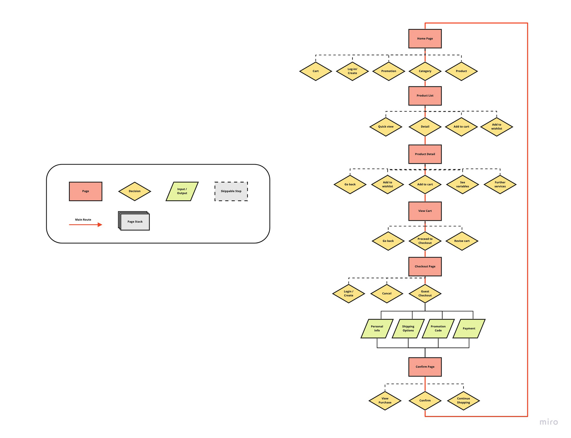
Wireframe & Guerrilla User Testing
I constructed a wireframe to visualize the design strategy and establish a basic structure of the web platform. Then, I conducted 1:1 guerrilla user testing with 5 users to find out potential issues in the user flow and iterate the wireframe before proceeding to the high-fidelity prototype. Below is some key feedback I learned from the users:
・Accessibility issue
・Inconsistent content and terminology
・The hierarchy of product information

Wireframe
The pages are arranged in an order to present the end-to-end flow of online purchases at Charmism's website.
The pages are arranged in an order to present the end-to-end flow of online purchases at Charmism's website.
Phase 4
Prototype
・High-fidelity mockup
・Interactive design
・Refine style guide
・High-fidelity mockup
・Interactive design
・Refine style guide
UI concept
The user survey showed that 29.6% of the users care about brand personality and product visuals, so I choice a UI style that could represent a sense of femininity, care, and elegance. The color scheme of the website could vary based on the marketing and advertising direction, which could be a breath of fresh air to keep the users' interest.
The user survey showed that 29.6% of the users care about brand personality and product visuals, so I choice a UI style that could represent a sense of femininity, care, and elegance. The color scheme of the website could vary based on the marketing and advertising direction, which could be a breath of fresh air to keep the users' interest.
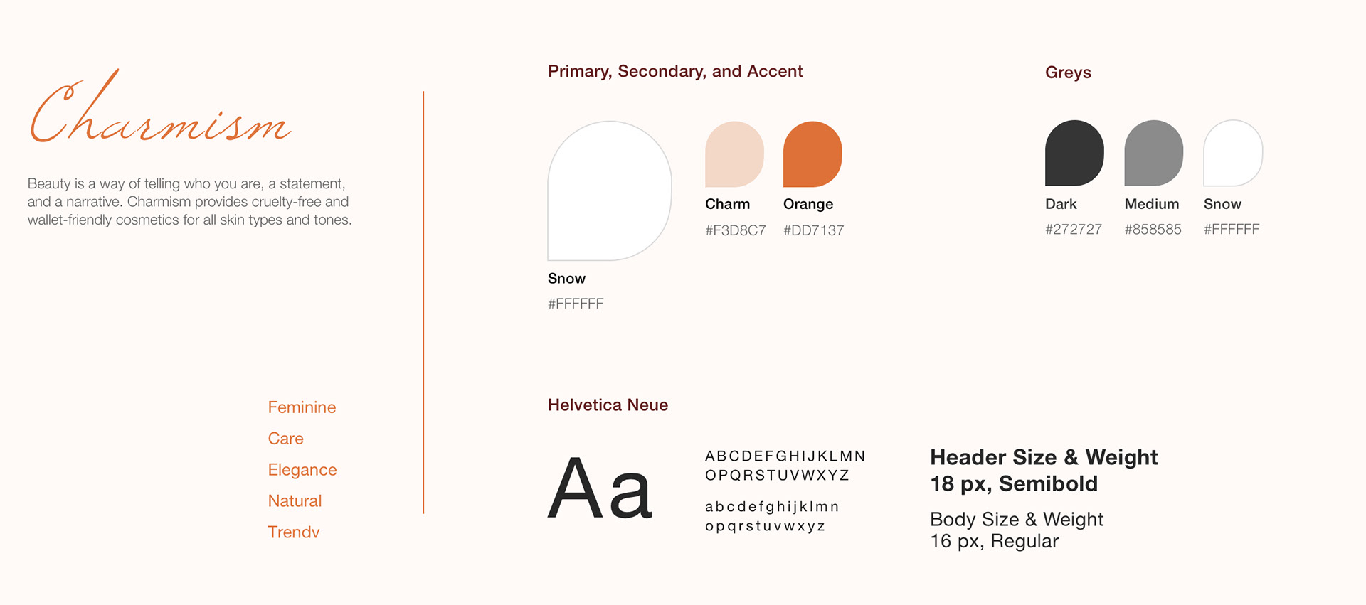
Style Guide
The ancient Romans associated peach color with the goddess Venus which perfectly aligns with the brand personality.
The ancient Romans associated peach color with the goddess Venus which perfectly aligns with the brand personality.

Phase 5
Test & Iterate
・User testing
・Iteration
・User testing
・Iteration
To uncover the usability issue of my design, I conducted 5 user testing with different users. During each test session, I was specifically looking for feedback on:
・Comparison chart
・Accessibility
・Checkout process
See below my main discovery from the tests and the corresponding iteration.
・Comparison chart
・Accessibility
・Checkout process
See below my main discovery from the tests and the corresponding iteration.
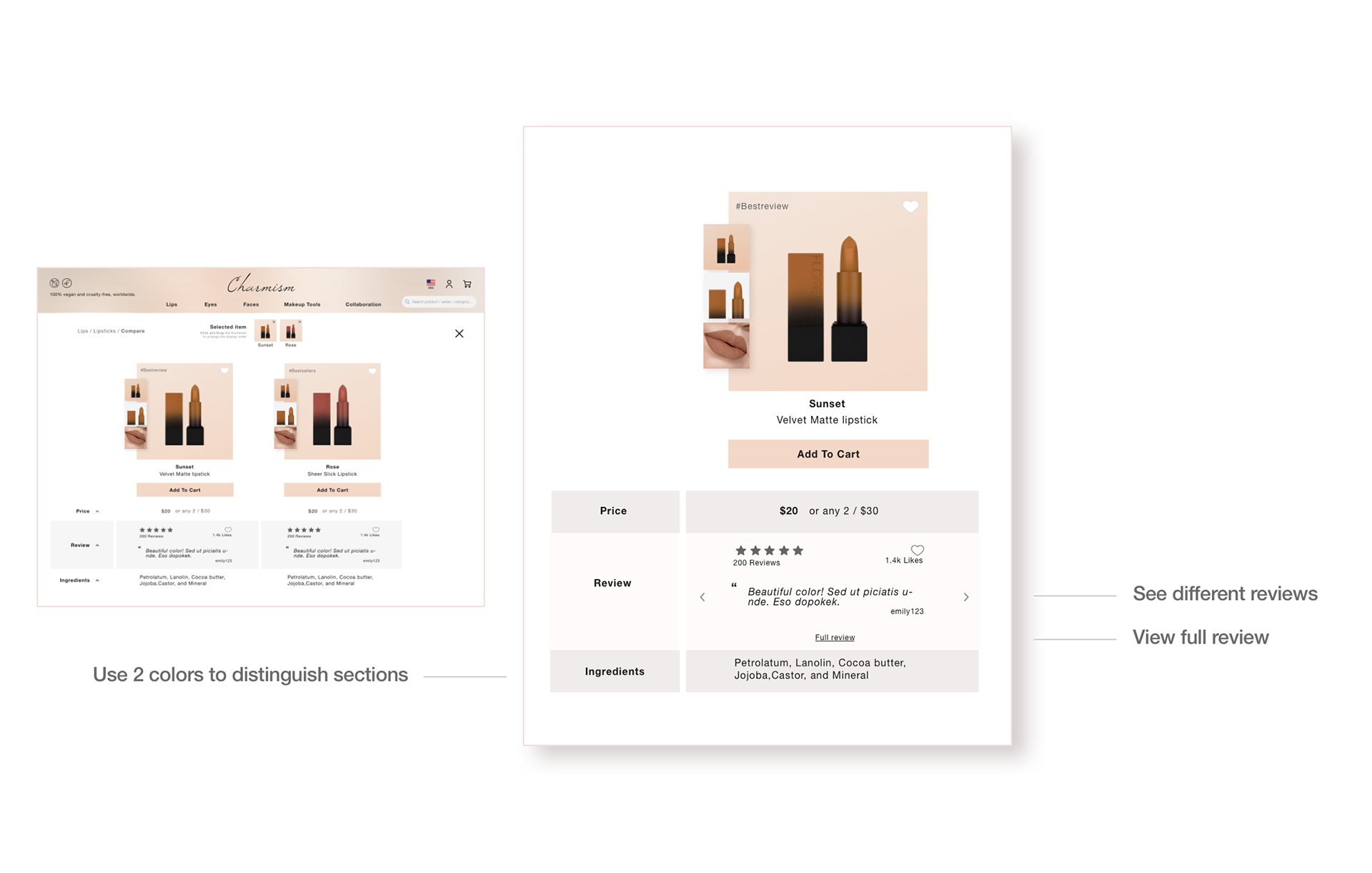
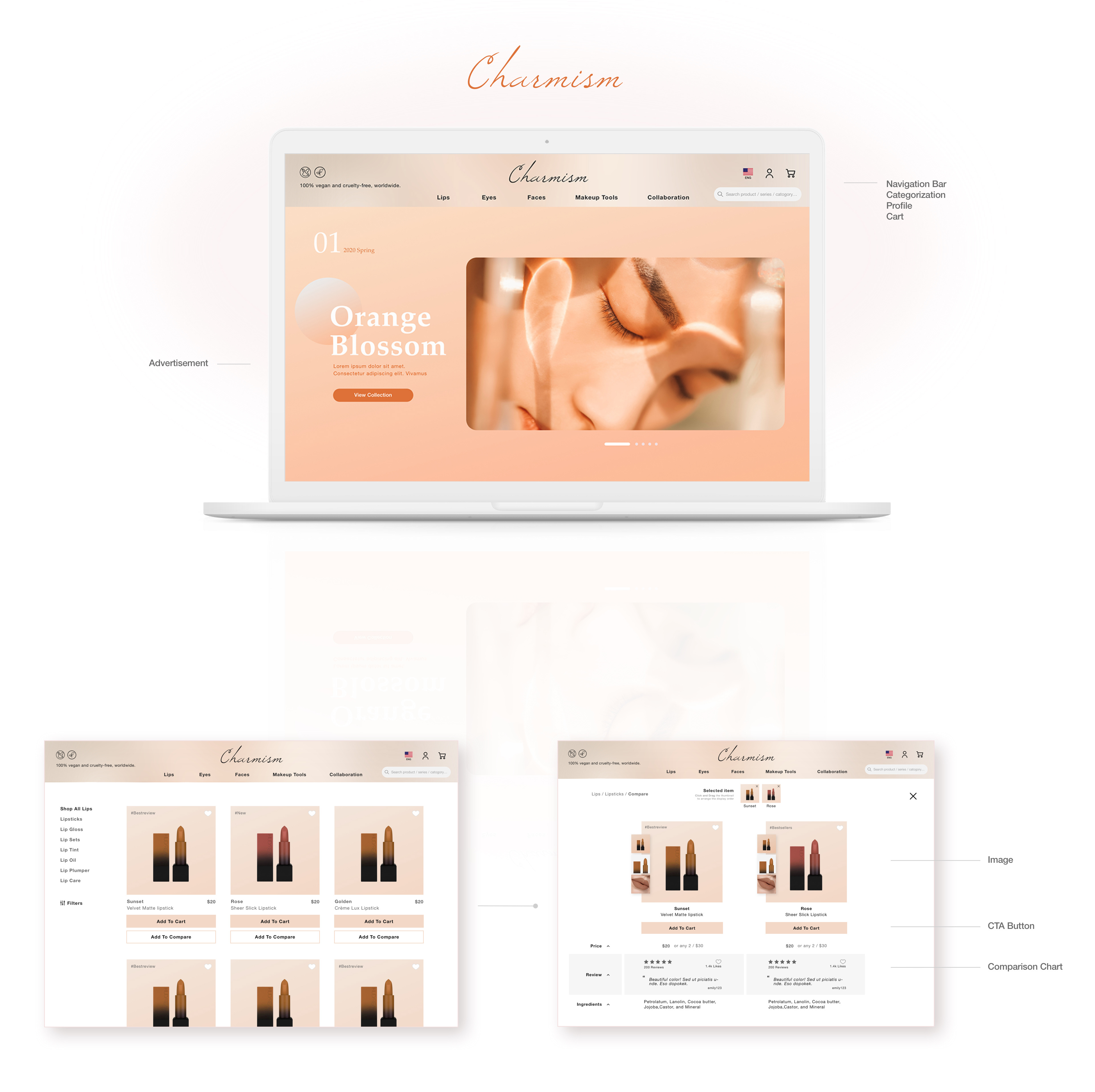
Comparison Chart
The comparison chart is where users can compare products and their information. 3 of the 5 users expressed their interest in reviews and ratings and mentioned they find product reviews extremely useful while comparing products. Also, there was no separation between Add To Cart and product price, which make the chart slightly hard to understand.
The comparison chart is where users can compare products and their information. 3 of the 5 users expressed their interest in reviews and ratings and mentioned they find product reviews extremely useful while comparing products. Also, there was no separation between Add To Cart and product price, which make the chart slightly hard to understand.
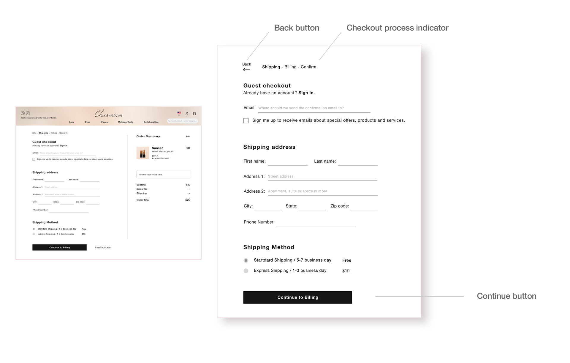
Checkout Process
The Continue Later next to the continue button was the portal to leave the checkout process, but the phrasing was confusing. I reflected on the business goal and considered the users' feedback, I decided to move the button to somewhere less noticeable, top-left, but phrase the button more straightforward.
The Continue Later next to the continue button was the portal to leave the checkout process, but the phrasing was confusing. I reflected on the business goal and considered the users' feedback, I decided to move the button to somewhere less noticeable, top-left, but phrase the button more straightforward.

Home Page
2 users suggested product promotion and discount information should be placed at a more noticeable place, and 3 users said cruelty-free and vegan product is an important message for them.
Also, only 1 user discovered the tag was clickable, so I added a subtle underline suggesting it is a clickable portal.
Reflects and What's Next
Although there are a lot of resources and inspirations out there to help re-designing an e-commerce website, I found the most valuable insight from the user survey and user interview. Although quantitative data is important to back up the business goal, understand users' needs from their perspective inform an intuitive and user-friendly design.
Accessibility Issue
I am not an accessibility export, and I had been encountering a lot of accessibility issues in this project. While looking up the design standard for color contrast ratio and proximity between each design component, I learned that having an accessibility checklist will be something useful to keep my design accessible.
More Testing
Although the changes are small, to ensure the iteration has solved the problem, I would conduct user testing again to see if the issues have drastically reduced.